
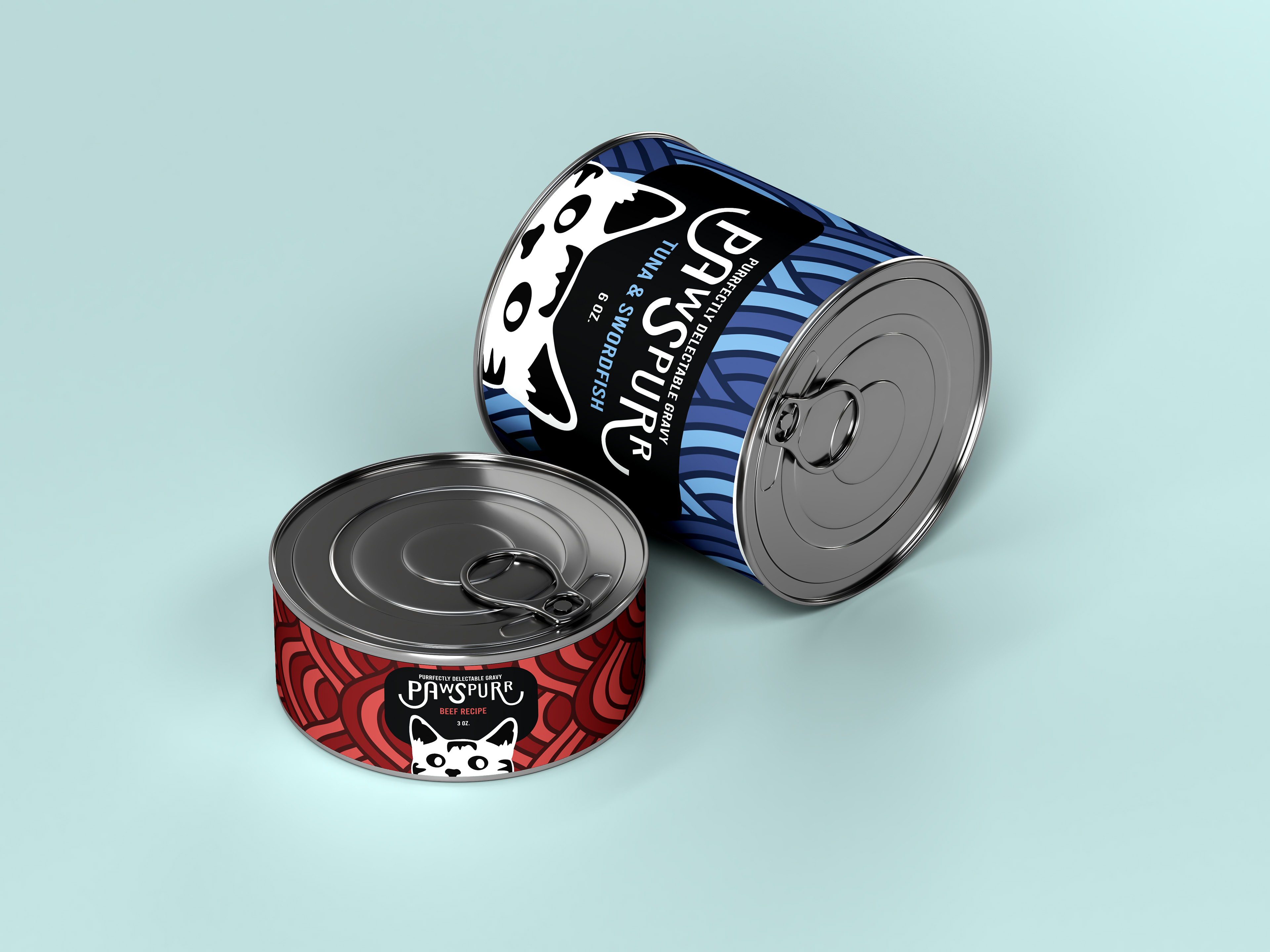
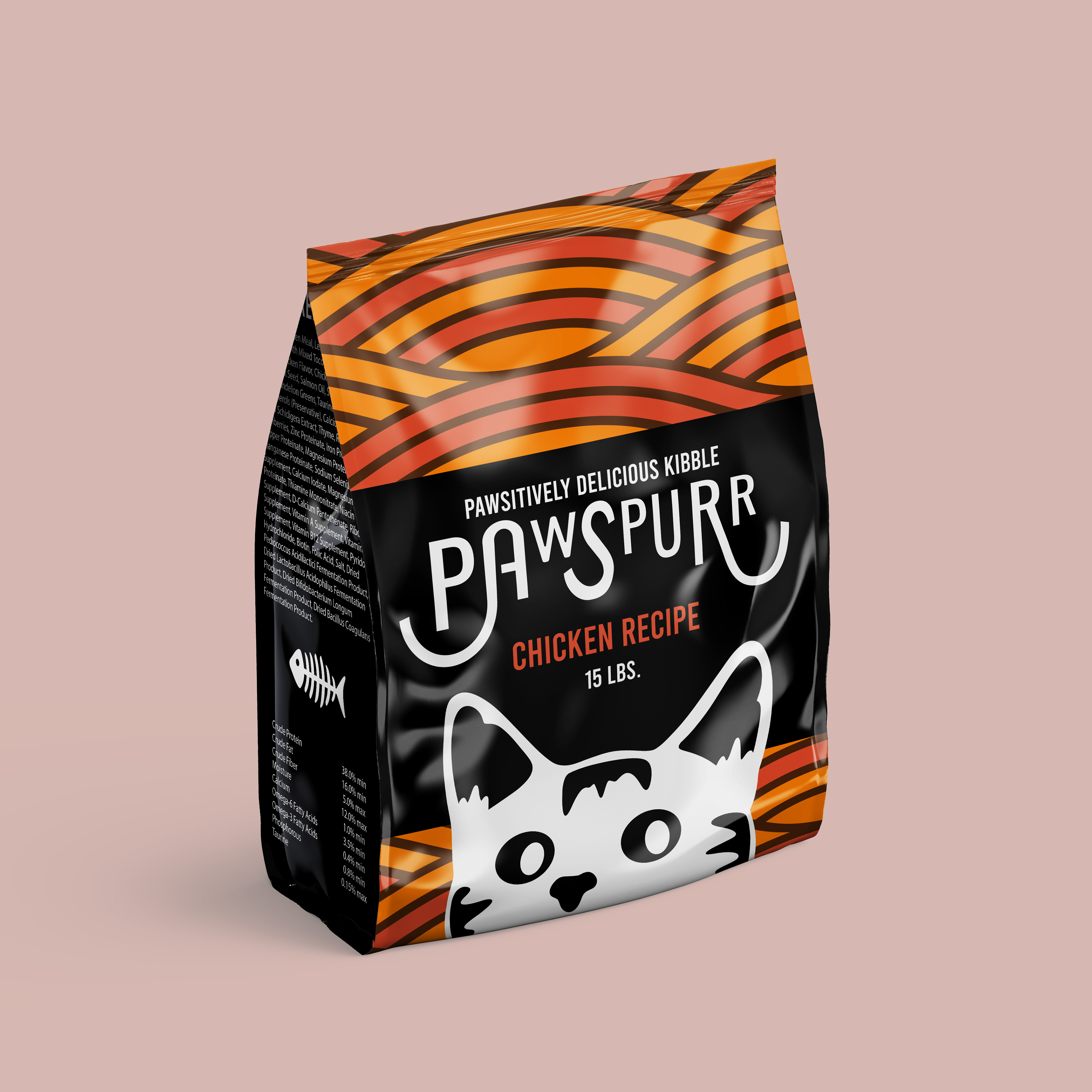
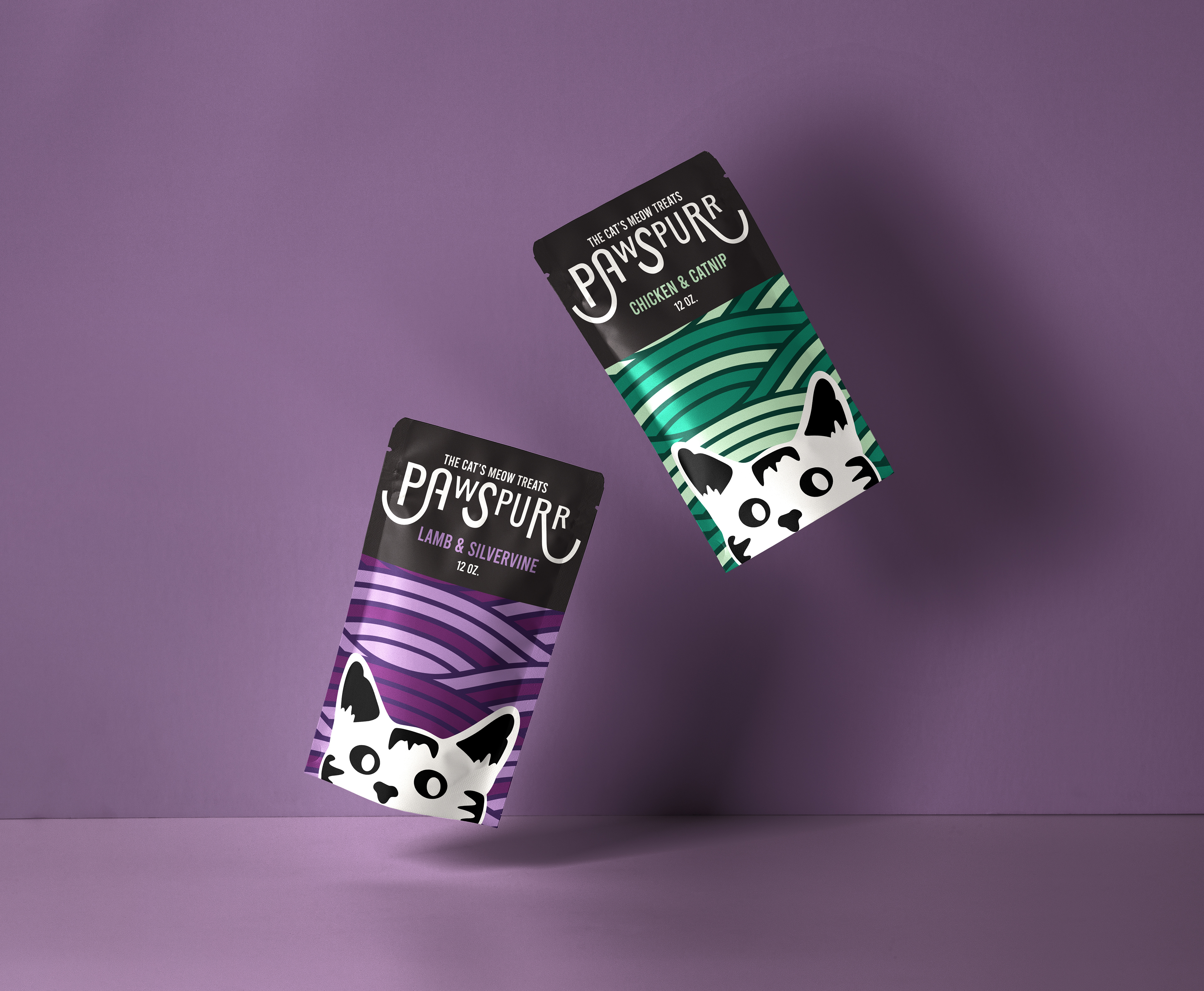
The pet food market is highly saturated, with all sorts of brands trying to compete for the spotlight. With that being said, many of these brands use similar tactics for their packaging, for instance: bright, solid colors accented by white, highly photographic with images of happy, healthy pets, and very simplistic typography. These tactics are used for a reason, they work, so I wanted to keep these ideals in mind while designing a product range that would stand out from the crowd.
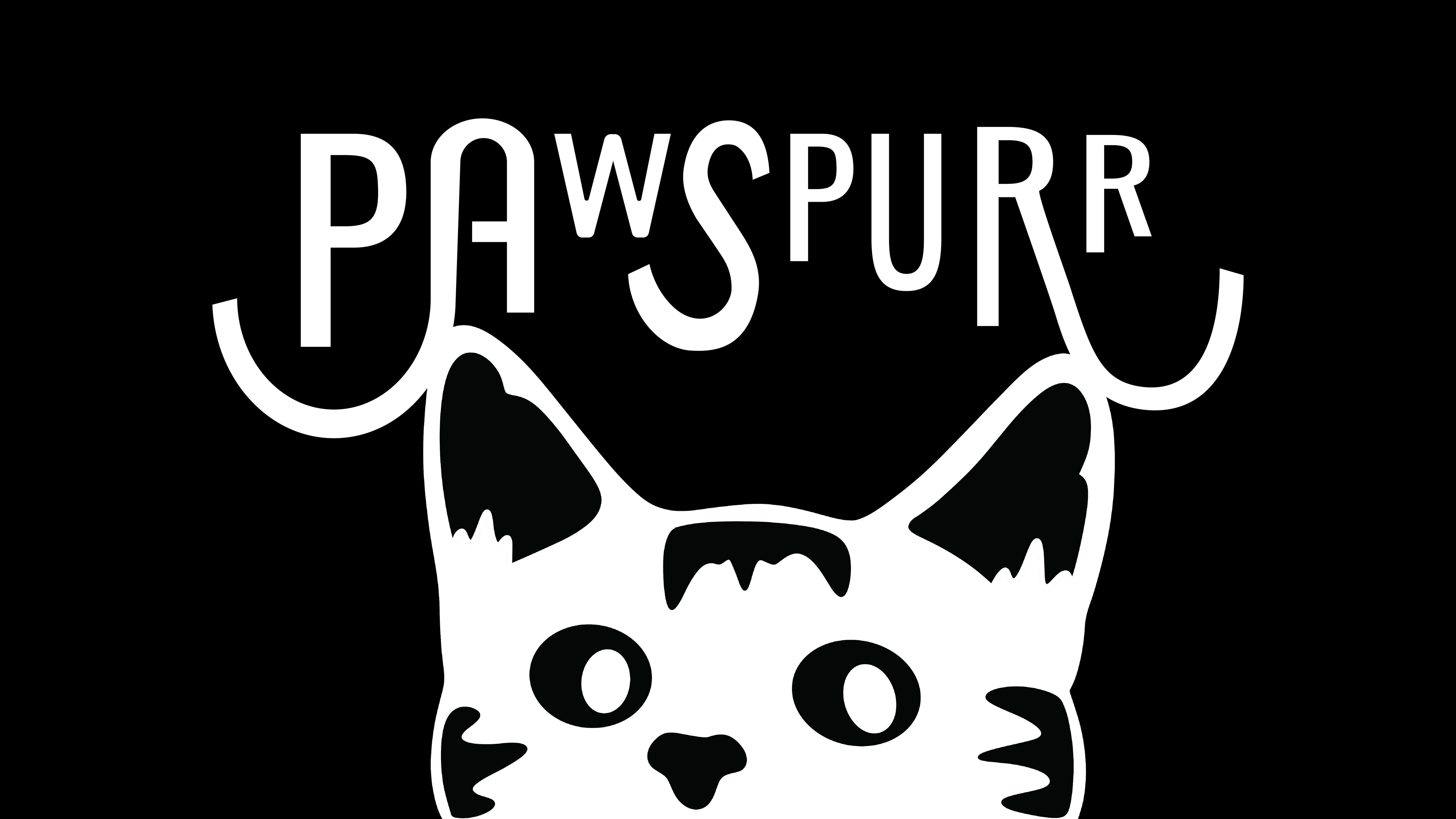
I utilized bright colors, but accented them with black as opposed to white, additionally I displayed these colors within a pattern instead of a solid fill to add extra visual intrigue. I took an illustrated approach rather than utilize photography, as that is seen much less within this industry. And, while most of the typography remained fairly simplistic so as not to distract from the other elements of the design, I wanted to create a logo that played with typography just a little bit.
Adobe Photoshop, Adobe Illustrator, Procreate