
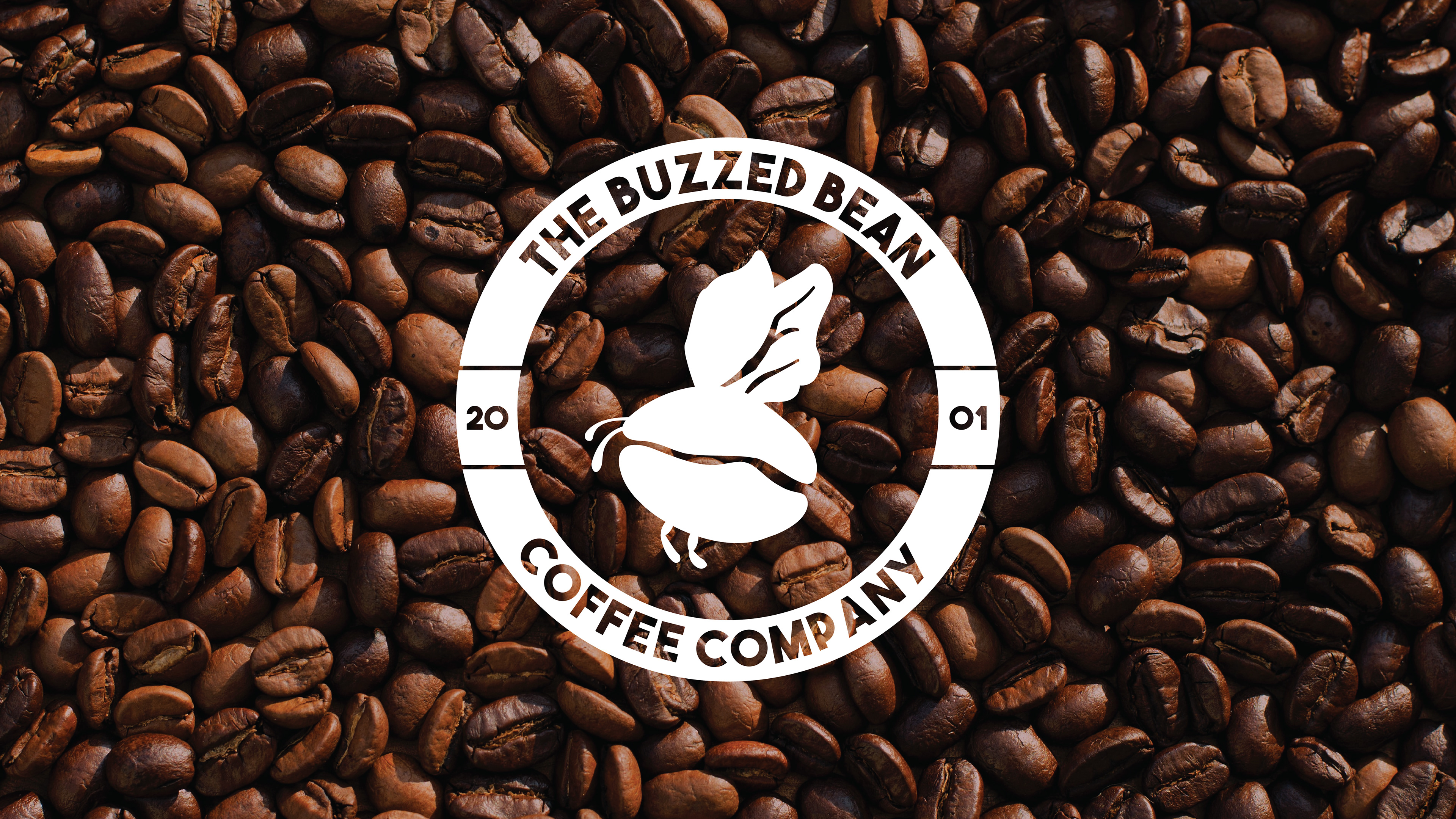
This is a fictitious coffee shop called The Buzzed Bean. My biggest hurdle with this project was perfecting the logo. Due to the sort of pun-based name I landed on for the company, I wanted the logo to reflect that playful, fun energy, while still maintaining a sense of simplicity and professionalism that would help it to immediately stand out in people’s minds, like the siren does for Starbucks.
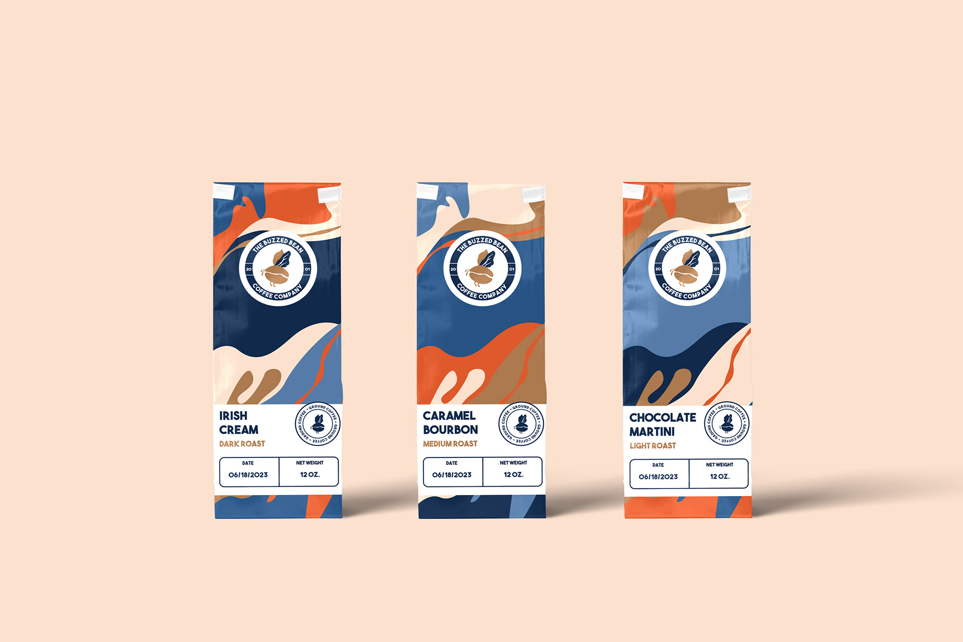
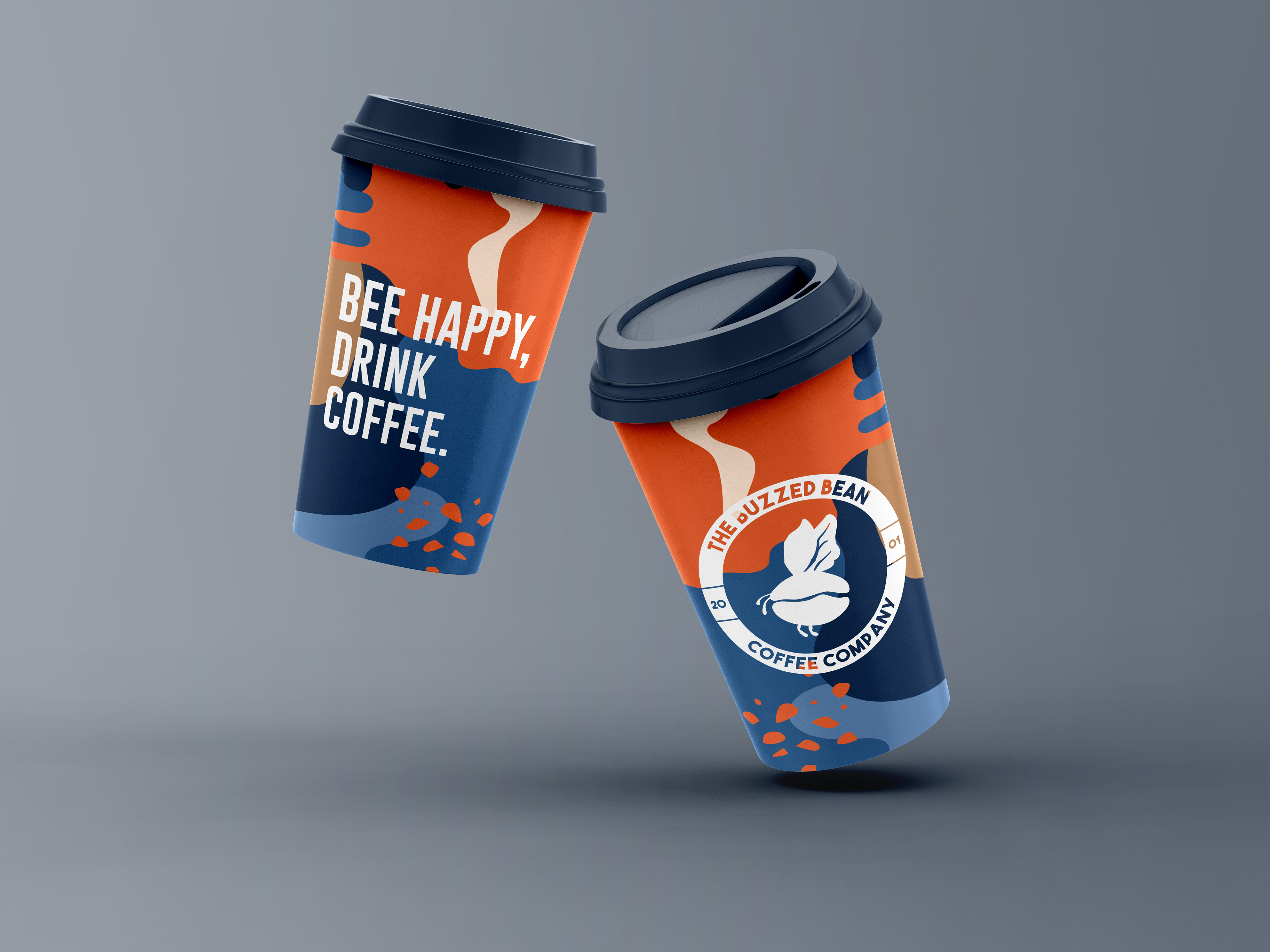
It was important to maintain the logo as the main focal point throughout the brand applications to further cement that imagery within the consumers’ minds. In order to carry on the fun, playful energy of the brand, however, I couldn’t just plaster the logo itself on these applications and call it done. To solve that problem, I created several bright patterns composed of organic shapes to utilize as a background element throughout the applications, that complements the logo but still adds much needed visual intrigue.
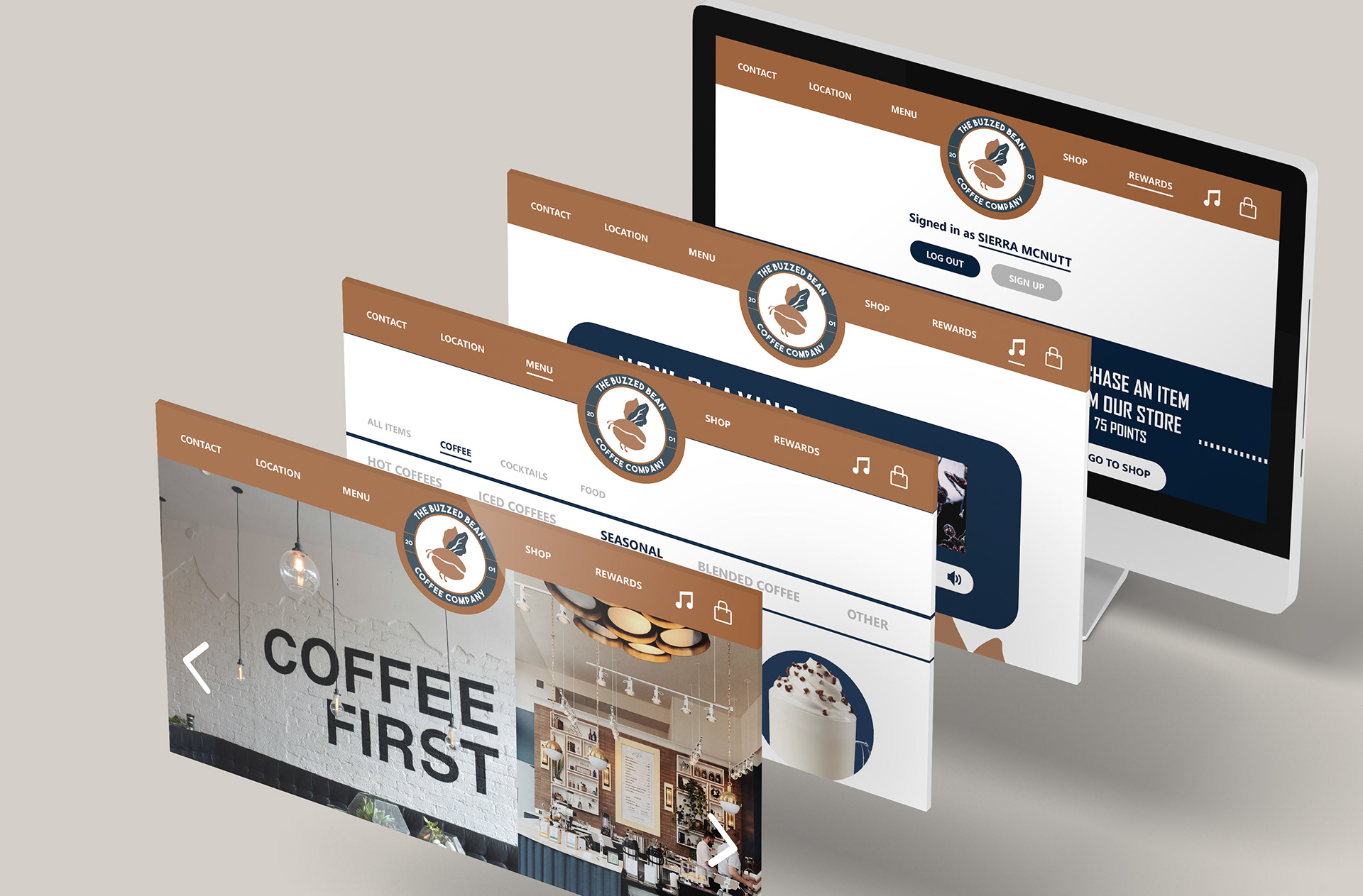
For the website, however, I didn’t want bright patterns to distract from the functionality, so I opted to stick to a more simplistic design and layout, and only utilized the colors seen in the logo itself to create a more cohesive and laid-back feel.
Adobe Photoshop, Adobe Illustrator